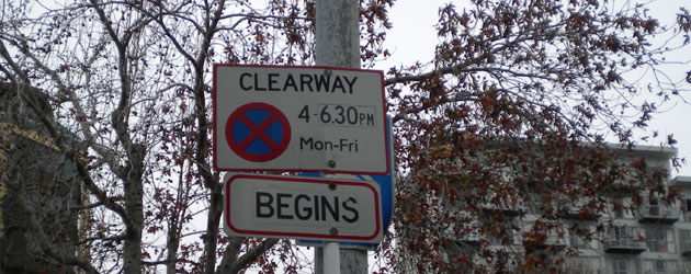
 Presumably, someone goes to the trouble of erecting a sign because it might be of use to the public. However, what’s the point of it if another department comes along and obscures the earlier message? Take a look at the sign above and see if you can guess what the obscured blue sign is trying to say.
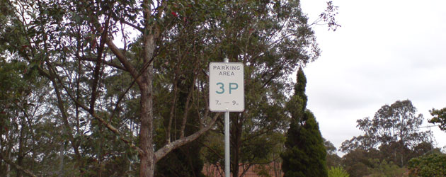
Here is another kind of sign that does not consider the user. It says that parking is three hours between 7 and 9, but it is difficult to see if that is AM or PM. How hard would it have been to increase the point size?
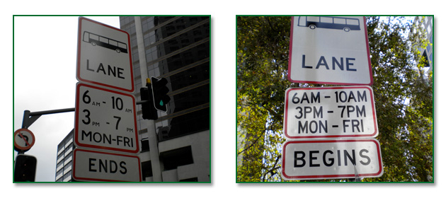
 When driving along Transit lanes and Bus Lanes, I find it frustrating to read whether or not a sign is for AM or PM. It keeps changing from suburb to suburb, and depending on which side of the road one is on. It’s bad enough trying to watch out for traffic, and to drive carefully, but why are some signs so high up that it breaks the neck to read them, and why do they use small point sizes for the AM and PM. While travelling at the speed of the traffic flow, it become impossible to work it out, especially of the sun is in one’s eyes, or if it is night time. Here are are two examples. The one on the right is better, and could be made clearer if there were spaces between the numbers and the AM or PM.
 It’s also interesting that the words ‘Begins’ and ‘Ends’ are written, where as the word ‘Bus’ is replaced with a drawing of a bus. Yes, universal symbols are helpful, but if someone cannot read the word ‘bus’, they are unlikely to understand what the word ‘begins’ means.
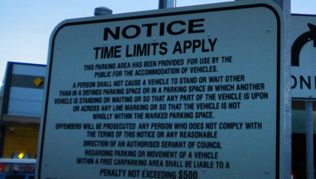
Here is a sign at a shopping centre. It says, ‘A person shall not cause a vehicle to stand or wait other than in a defined parking space or in a parking space in which another vehicle is standing or waiting…’. This is completely erroneous. In plain English, this instruction (a by-law really) is saying, ‘You can only park in marked spaces or in a space where there is a car already parked…’ So the Council seems to approve of two cars on top of each other.
 For other similar observations, click on the links below:
![]()


Comments are closed.